Explore 15 granite colors for warm wood kitchens, with tips for matching stone undertones and patterns to your cabinets and lighting.
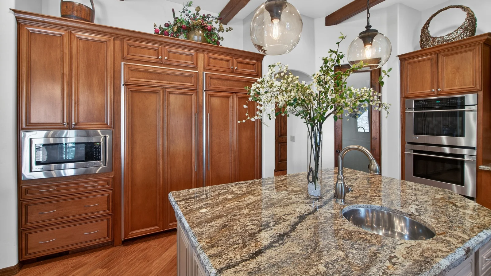
15 Granite Countertop Colors That Pair Beautifully With Warm Wood Kitchens
Granite’s natural variation is its biggest design advantage—and its biggest gamble. Each slab has its own mineral patterns, veining, movement, and color, so a name on a sample can only tell you part of the story. The useful question is how that particular slab will sit beside the wood already in your kitchen.
Look for granite whose color temperature and pattern work with your cabinets, island, tabletops, or wood trim. Veining that picks up the direction of the wood grain can help the materials feel connected. So can a granite base or accent color that echoes the wood’s warm undertones. Get the balance wrong, though, and a large countertop can feel like an isolated feature—or make an already busy room feel busier.
There are a couple of ways to handle dark cabinetry. A lighter granite can bounce light around the room; a counter close to the cabinet color can create a calm, near-monochromatic effect that makes the space feel more expansive. Either way, don’t choose from a small sample alone. Request samples of the granite slab and compare them against your wood’s color, grain, and finish in different lighting and at different times of day. If you’re weighing cabinet colors too, this guide to coordinating granite countertops with warm wood kitchen cabinets is a useful starting point. Here are 15 colors to consider.
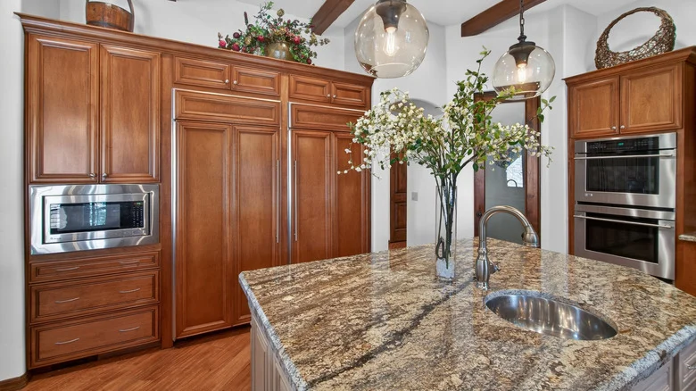
Colonial Cream
Honey and golden oak already bring plenty of warmth to a kitchen. Bright white granite can feel stark beside it, while a very dark counter may dominate the room. Colonial Cream takes a quieter route: its cream-and-beige base carries small flecks of brown, rust, and dark gray, picking up oak’s warmth without competing with its grain. Cream, soft gray, and pearlescent white are also options for giving dated oak cabinets a stylish refresh.
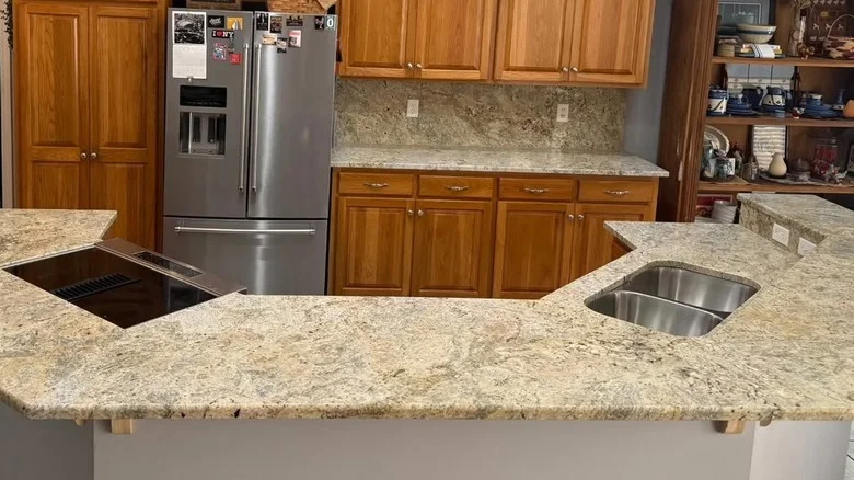
Coffee Brown
For maple cabinets in a medium stain—praline, honey, autumn, or caramel—Coffee Brown offers depth without abandoning the warm palette. The granite’s chocolate-brown ground is dotted with pearlescent white and tan. Those coffee-and-cream flecks give the wood some contrast, while the darker stone can anchor lighter maple accents, tabletops, and trim. The result feels earthy and classic. These paint shades also work well in warm wood kitchens.
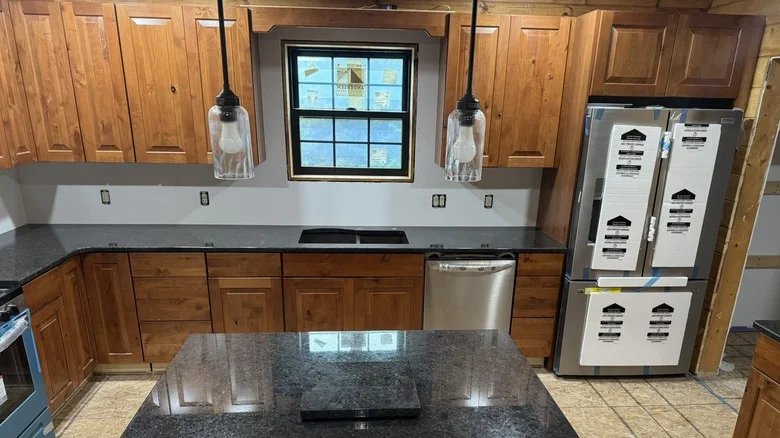
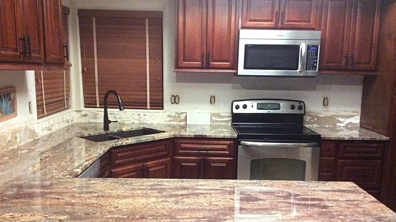
Crema Bordeaux
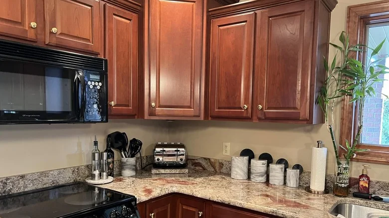
Cherry wood has a rich color and a noticeable luster; granite with red, brown, or gold undertones can reinforce both. Crema Bordeaux brings a rosy or pale burgundy base, crossed by cream, gold, brown, and gray veins. Its movement adds texture, but the warm palette helps it sit alongside cherry’s grain. That makes it a natural fit for traditional, rustic, or otherwise warm kitchen designs.
Black Galaxy
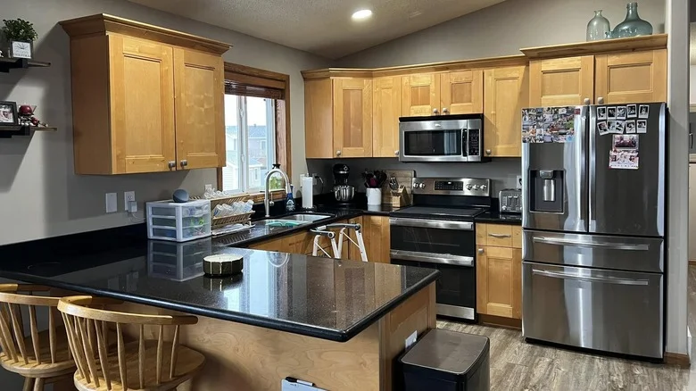
Black Galaxy is a statement counter. Deep black stone and bright flecks of gold, copper, and silver draw the eye, so the wood needs to temper that contrast rather than add another competing feature. Pale golden or honey oak does the job: its warmth softens the dark surface and keeps the kitchen from feeling severe. The pairing is Erin Napier-approved, too.
Ambrosia White
Dark walnut, deep cherry, and espresso-stained oak can make a kitchen feel enclosed if the other surfaces don’t bring enough light into the room. Ambrosia White provides a strong counterpoint: a creamy white background with high-movement veins in dark green or gray, plus softer speckles in dark gray, pearlescent white, or pale brown. Against dark wood, that contrast can brighten the room and keep the cabinets from swallowing it.
Kashmir White
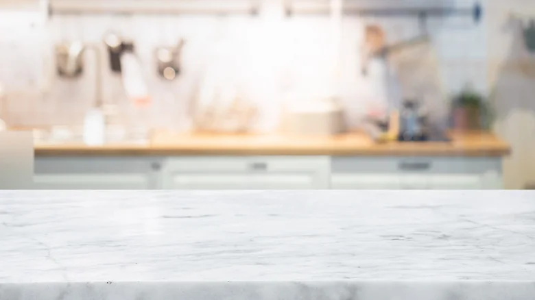
Kashmir White shows why a pale counter can work with dark, red toned cabinetry: its scattered burgundy and brown flecks pick up cherry wood’s warmth, while the white ground lifts the room. Dark gray and black specks add contrast without making the pattern feel busy. The same stone can sit comfortably beside light maple, honey oak, or almond stained maple.
Bianco Antico
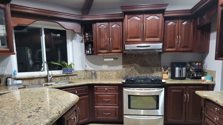
Keeping older stained cabinets can be a deliberate design choice. Bianco Antico gives vintage wood a lift with a pale gray or white base, then ties into mahogany, chestnut, and amber finishes through pink, garnet, burgundy, beige, and black details. It can also suit woods with red, orange, or yellow undertones. Here’s the catch: its active pattern needs restraint around it. Simple cabinet profiles and neutral colors let the stone do its work without crowding the room. If you’re weighing whether to keep those vintage, dark-stained wooden cabinets, the counter can change the room’s mood without a coat of paint.
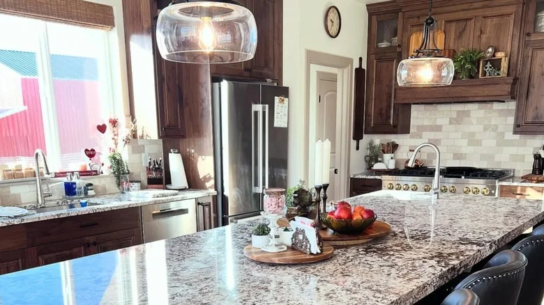
Virginia Mist
Virginia Mist makes a stronger case for contrast. Its charcoal-black surface is dotted with soft gray and white, a combination that can temper the orange cast of warm oak. The finish changes the effect: hammered, sawn, honed, and polished surfaces are all options, while a honed or leathered granite finish gives it a soapstone-like look with a rustic edge. Against pale golden maple or lighter cherry, the dark stone reads as a deliberate anchor.
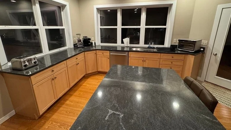
Giallo Fiorito
For honey oak, Giallo Fiorito keeps the palette cohesive rather than fighting the wood’s warmth. Its golden yellow, beige, or tan base carries small brown, black, and gray crystals; the even grain and limited veining make it a relatively calm choice beside natural wood. That same warmth can also brighten darker cabinetry, including walnut, mahogany, and dark espresso oak.
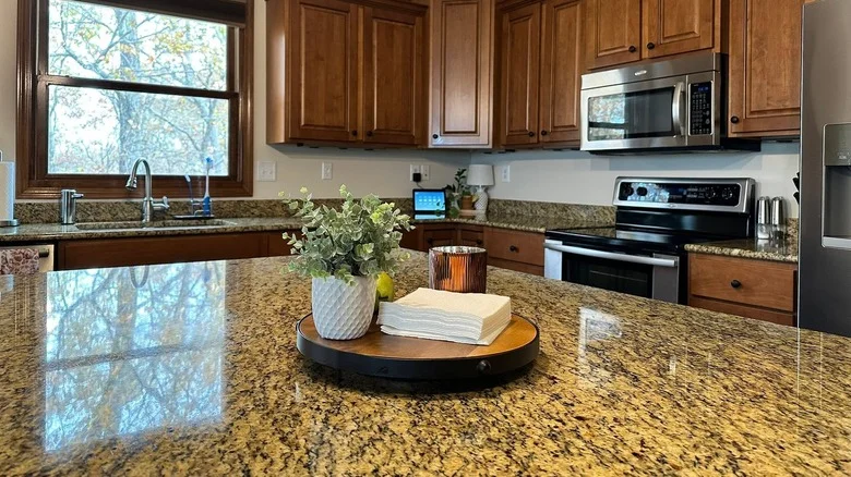
Baltic Brown
Baltic Brown is a pointed choice for a dark, enveloping kitchen. Its chocolate-brown field and small tan and gray flecks bring out the rust-red warmth in dark maple or cherry, while the lighter marks keep the composition from becoming a solid block of color. Some may call it an outdated granite countertop color; that label misses the appeal of its cozy, dark-academia look. It’s a distinct style, and that’s the point.
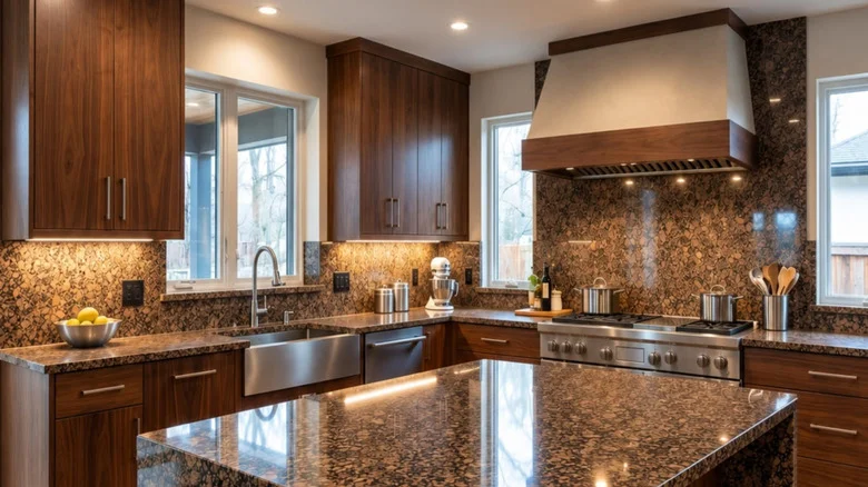
River White
River White brings light into a room without making the counter look flat. Its ivory or cream ground and restrained gray veining contrast with dark wood and can brighten wood paneling in retro kitchens. The veining adds a sense of motion that may help a kitchen feel more expansive. Pair it with honey oak or amber maple and the result shifts toward an airy, timeless look; with darker cabinetry, the contrast is more pronounced.
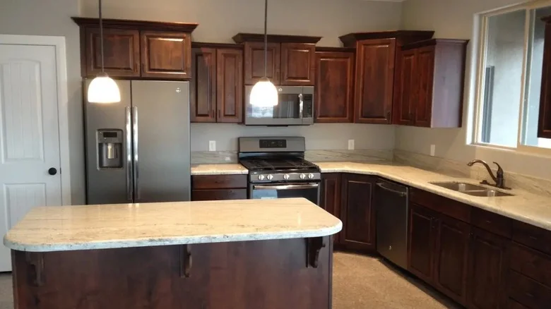
Titanium
Plain honey oak or warm maple leaves room for a more dramatic counter. Titanium has a dark black, charcoal, or brown base crossed by flowing bands of gold, silver, ivory, and white quartz, so it draws attention while picking up the wood’s golden tones. It also suits rustic, unfinished cabinets and a country or farmhouse kitchen design. If you want the cabinetry to recede, this isn’t the stone for you.
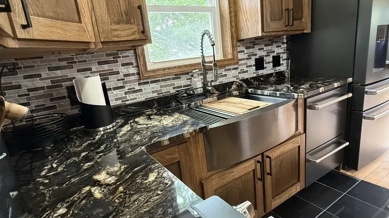
Desert Dream
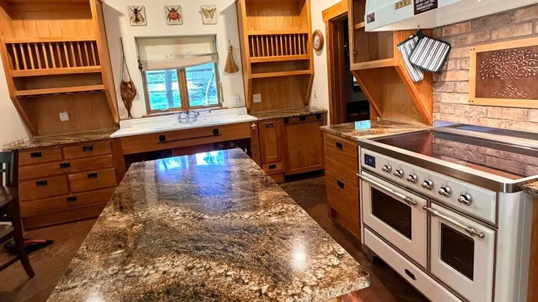
Granite that pulls warmth from wood
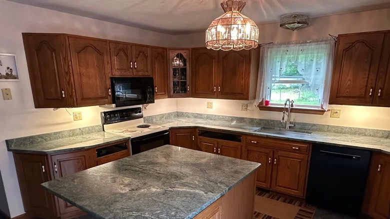
These final options show how far granite can move beyond neutral. Costa Esmeralda, misspelled “Costa Esmerelda” in the source text, is a pale gray-green stone with darker green, white, and gold veins. It gives a green kitchen an alternative to white, gray, or brown counters, and its soft color suits honey oak, golden pine, maple, amber-stained oak, acacia, and hickory. Add tan, cream, or blue elsewhere in the room, and the counter can make the space feel brighter and calmer. If you’re considering green cabinetry, these green kitchen ideas offer more inspiration.
Rose Gold takes a bolder route. Its pink-gold, copper, or peach base is flecked with cream, brown, and gray, echoing the deep red and golden notes in cherry, walnut, mahogany, and warm-stained maple or oak. That makes it an especially natural fit for a rustic kitchen. The useful point is that a warm countertop doesn’t have to match the wood exactly; shared undertones can make the pairing feel considered and inviting. For more ideas, see these rustic kitchen design tips.
Desert Dream offers a darker, more dramatic counterpoint: a charcoal or black field crossed by gray, beige, gold, or brown veining that recalls patterns in desert washes after rain. It pairs with oak, walnut, and maple by picking up the woods’ golden and yellow tones, and it sits comfortably alongside earth-toned floors and paint.


Discussion
Sign in to join the discussion.